Achieva Vending
Re-designing a vending provider's website
Overview
Achieva Vending Pte Ltd is an SME (Small and Medium-sized Enterprise) in Singapore that provides vending services for food and beverages. The design of its company website looks increasingly outdated compared to its competitors, and the accessibility of information on the website fell short of users' expectations. An overhaul feels long overdue and will help ensure the company can remain competitive in the industry. I enhanced the overall site experience by improving the site's visual design and information architecture for better clarity on the business's solutions available. I also worked with the business owners and sales personnel to revamp the UX writing of the pages. The site was built using Weebly.Scope
Web Design , Visual DesignYear
2022The Problem
The main reasons behind the re-design were as such:
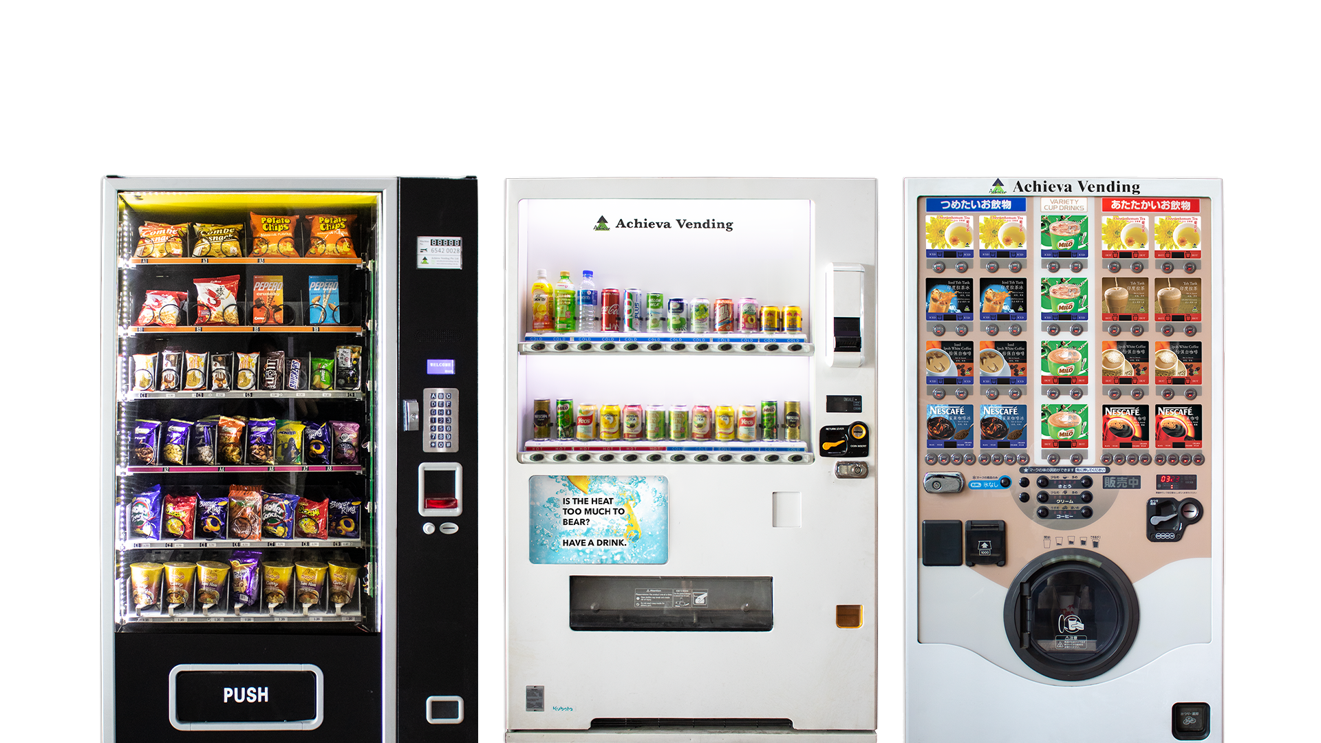
- The site looked outdated and contained visuals of poor resolution.
- It did not offer a seamless experience across all devices.
- It neither met new business needs nor reflected the business’s values well.
Research
Target audience
To identify the main types of users visiting the company’s website, I scouted past contact form submissions to understand why users visited the site.
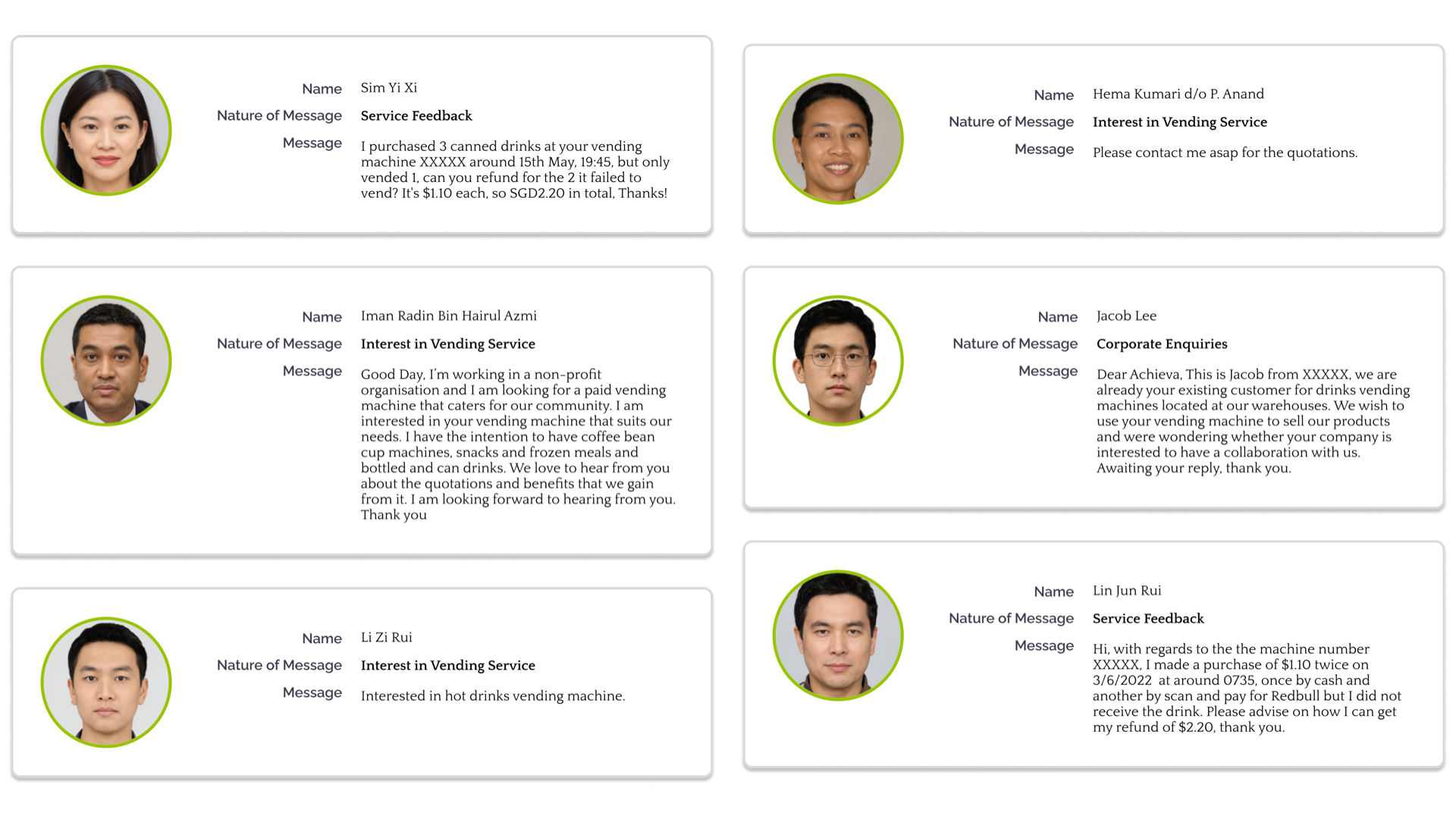
The main types of users identified were:
- Potential customers looking for vending solutions,
- Existing customers in need of service support or wishing to provide feedback and
- Food and beverage suppliers looking for collaboration.
Content Strategy
I spoke to the founder and sales team to understand the company’s strategy in standing out from its competitors.
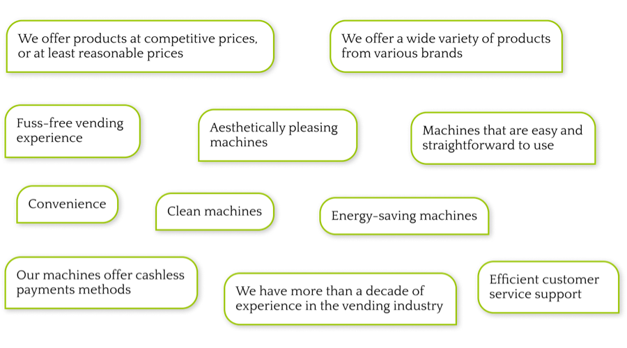
Voice and Tone
What sets the company apart, as an SME, is also the cordialness it offers to its customers. With this and the above list in mind, the improved website should, therefore, adopt a clean look and adopt a friendly tone of writing.
Ideation
Competitive Analysis
For the initial brainstorming, I sourced inspiration from the websites of other vending providers, both local and abroad and identified the good attributes that I could learn from, such as understanding common industry terms to help in clarity in communication for the new website.
Information Architecture
After a preliminary sharing and discussion with the business owners, some sections in the proposed IA were removed due to business considerations and eventually looked like this:
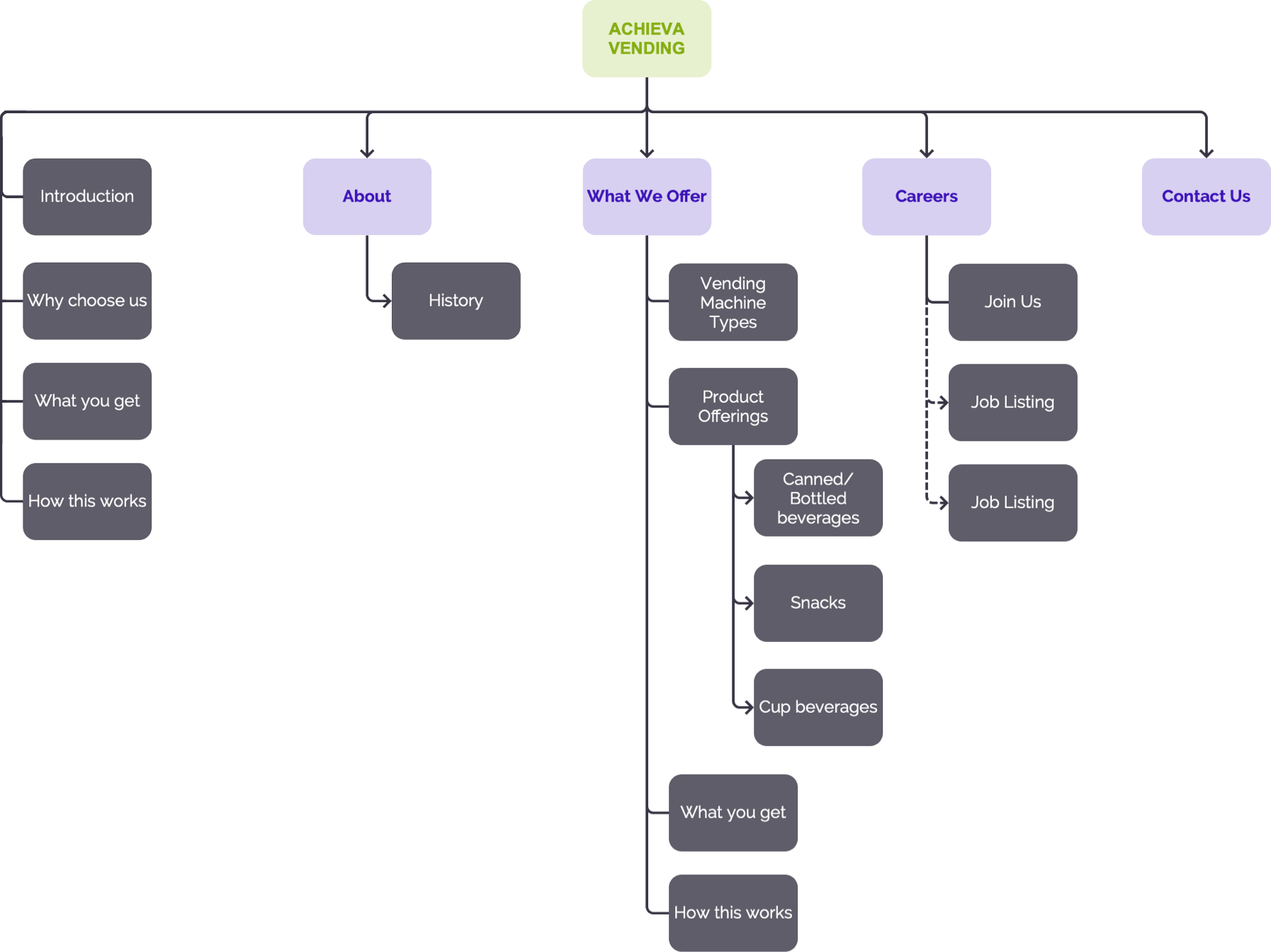
The new website adds a new ‘Careers’ page to help raise the visibility of the vacancies available in the company given the business’s manpower shortage needs.
Wireframing
I started conceptualising by first creating low-fi wireframes on a note-taking app.
")
")
")
")
Prototyping
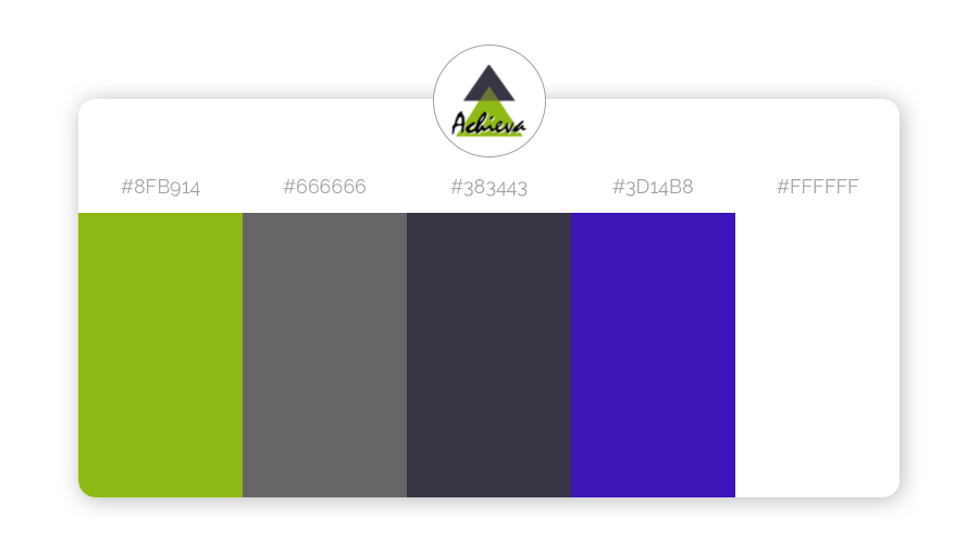
Color Scheme
The site’s colour scheme builds upon the colours existing in the company’s logo by adding a colour (Trypan Blue #3D14B8) that is complementary to the Apple Green (#8fb914) present in the logo.
High-fidelity prototypes
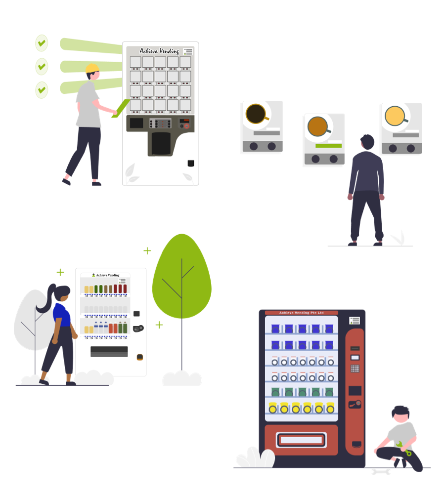
I made the hi-fi prototypes with Sketch, the visual graphics with Adobe Illustrator and Photoshop.
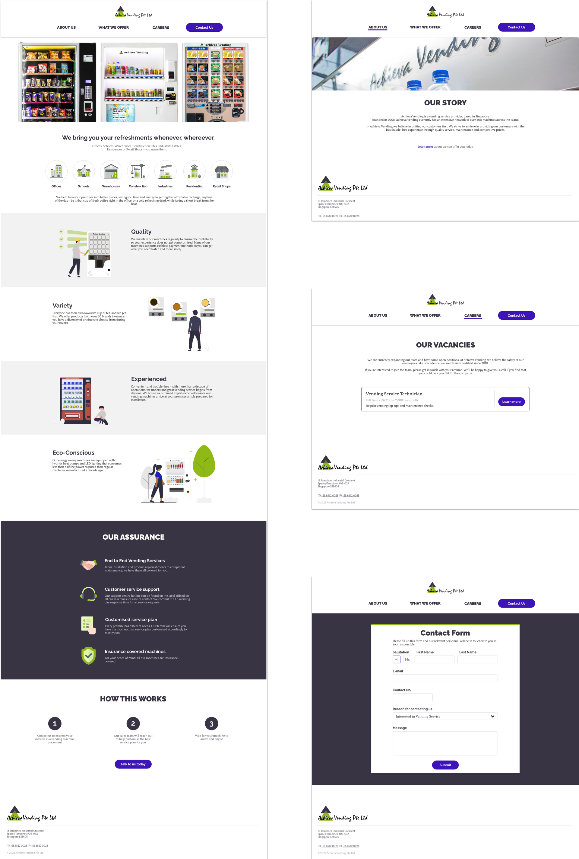
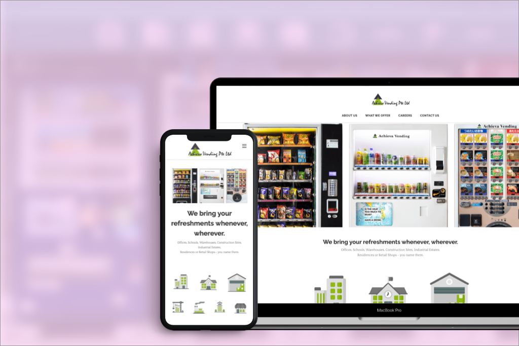
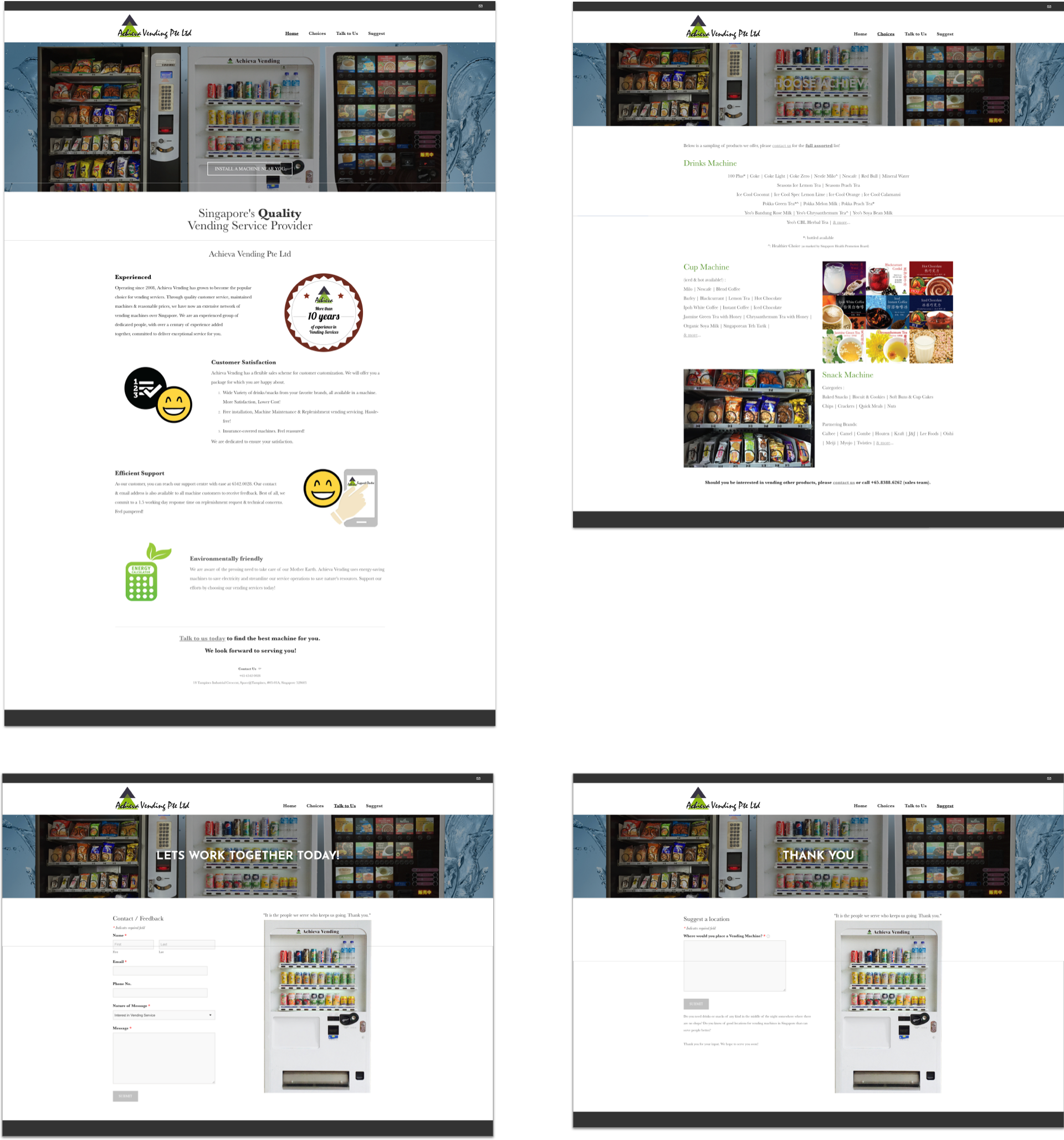
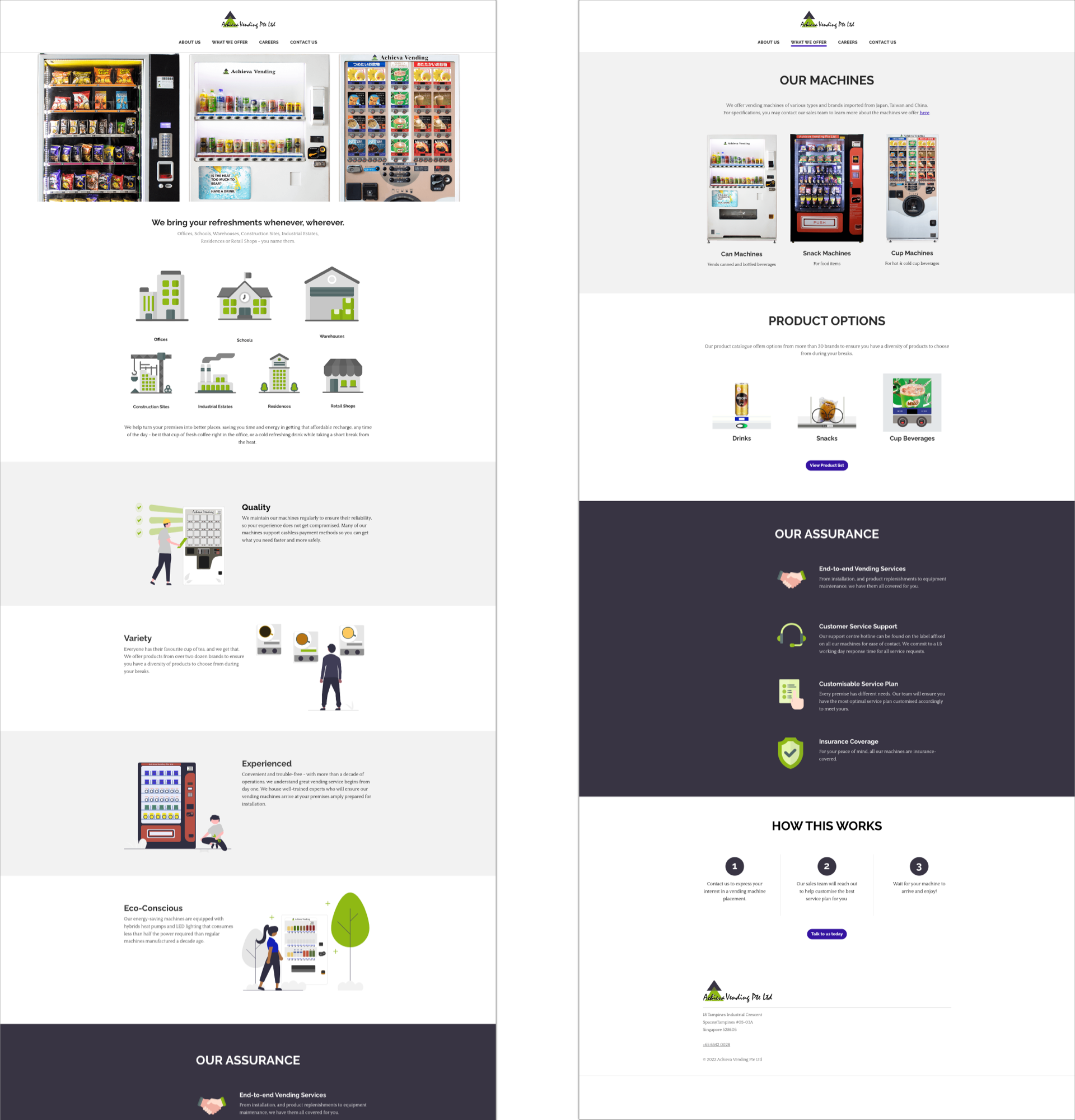
The Final Product
Implementation
The site was implemented and published with Weebly. I built the site on top of an existing theme available and then modified it to match my designs using the HTML editor. Below are screenshots of the improved website.
Evaluation
Constraints
Budget considerations and limited functionalities of the Weebly website builder meant that many design decisions had to be tweaked due to a lack of feasibility in implementation, or else to ensure a seamlessly responsive experience across mobile devices.
Areas for Improvement
Vending Machine specifications such as the machines’ dimensions and power input are required to allow potential customers to gauge the feasibility of employing the company’s services before reaching out. This information was included in the initial planning during ideation but has been omitted later due to the lack of data available.
Project Learnings/Takeaways
- Focus on building an MVP first. In an SME, there is only so much time and effort that its staff can invest for you, so it’s important to focus on building an MVP and then improving from there (e.g. including vending machine specifications)
- Always make sure you fully understand your constraints prior to designing. I began re-designing certain micro-interactions without first verifying if it was feasible to implement those designs on the site builder. I later had to tweak my design to fit within the constraints of Weebly’s site-building tools.
- Business considerations are prime. As much as UX is important to me as a UX practitioner, paying more monthly to deploy a website that offers a better UX to the site visitors but has little add-on value to the business is deemed unnecessary by the business owners. As such, the improved website still builds upon the Weebly website builder, instead of other website builders available in the market that offers greater flexibility in design.